
Thanks for reading! ☀︎
Rethinking the Renaissance app experience
Did you know 61 million Spotify users
are not consider music fans but music super fans?
Did you know 61 million Spotify users are not consider music fans but music super fans?
Despite this, there isn’t a dedicated place for fans to connect to one another, or their favourite artists. This leaves fans spread out across forums, social networks and fragmented fan clubs.
Despite this, there isn’t a dedicated place for fans to connect to one another, or their favourite artists. This leaves fans spread out across forums, social networks and fragmented fan clubs.

Overview
Problem
Despite millions of under 30s using Spotify daily, fans had limited ways to meaningfully connect with artists or each other.
Renaissance set out to close this gap, but limited engagement and a 2.8 App Store rating highlighted friction in the existing experience.
Problem
Despite millions of under 30s using Spotify daily, fans had limited ways to meaningfully connect with artists or each other.
Renaissance set out to close this gap, but limited engagement and a 2.8 App Store rating highlighted friction in the existing experience.
Outcome
App Store rating increased from 2.8 to 3.2 within three months, then to 4.1 within a year
47% of users active after 90 days
Organic downloads doubled from 380k to 790k with no marketing spend
Outcome
App Store rating increased from 2.8 to 3.2 within three months, then to 4.1 within a year
47% of users active after 90 days
Organic downloads doubled from 380k to 790k with no marketing spend
Outcome
App Store rating increased from 2.8 to 3.2 within three months, then to 4.1 within a year
47% of users active after 90 days
Organic downloads doubled from 380k to 790k with no marketing spend
Project Details
My Role
I was the sole researcher, UX and UI designer on a team of 8. I worked closely with 1 Product Manager and 2 Engineers
My Role
I was the sole researcher, UX and UI designer on a team of 8. I worked closely with 1 Product Manager and 2 Engineers
My Role
I was the sole researcher, UX and UI designer on a team of 8. I worked closely with 1 Product Manager and 2 Engineers
Timeframe
4 months from discovery research to hand-off
Timeframe
4 months from discovery research to hand-off
Timeframe
4 months from discovery research to hand-off

Understanding the problem
In-depth strategy and discovery research was conducted to identify the app’s current limitations and define a clearer direction forward.
I began with a heuristic evaluation, competitor research, and by compiling user reviews.
Most apps that connect to Spotify, prioritised stats and social listening, with limited gamified artist–fan connection. Feedback from the app store and socials confirmed our users cared about this connection, showing us a gap in the market.
I began with a heuristic evaluation, competitor research, and by compiling user reviews. Most apps that connect to Spotify focused on streaming stats and comparing music with friends, with very limited gamified ways for fans to connect directly with artists.
Mixed panel data, feedback on the app store, and social media discourse, showed this was what users actually cared about. Revealing a gap in the market.

I began with a heuristic evaluation, competitor research, and by compiling user reviews. Most apps that connect to Spotify focused on streaming stats and comparing music with friends, with very limited gamified ways for fans to connect directly with artists.
Most apps that connect to Spotify, prioritised stats and social listening, with limited gamified artist–fan connection. Feedback from the app store and socials confirmed our users cared about this connection, showing us a gap in the market.
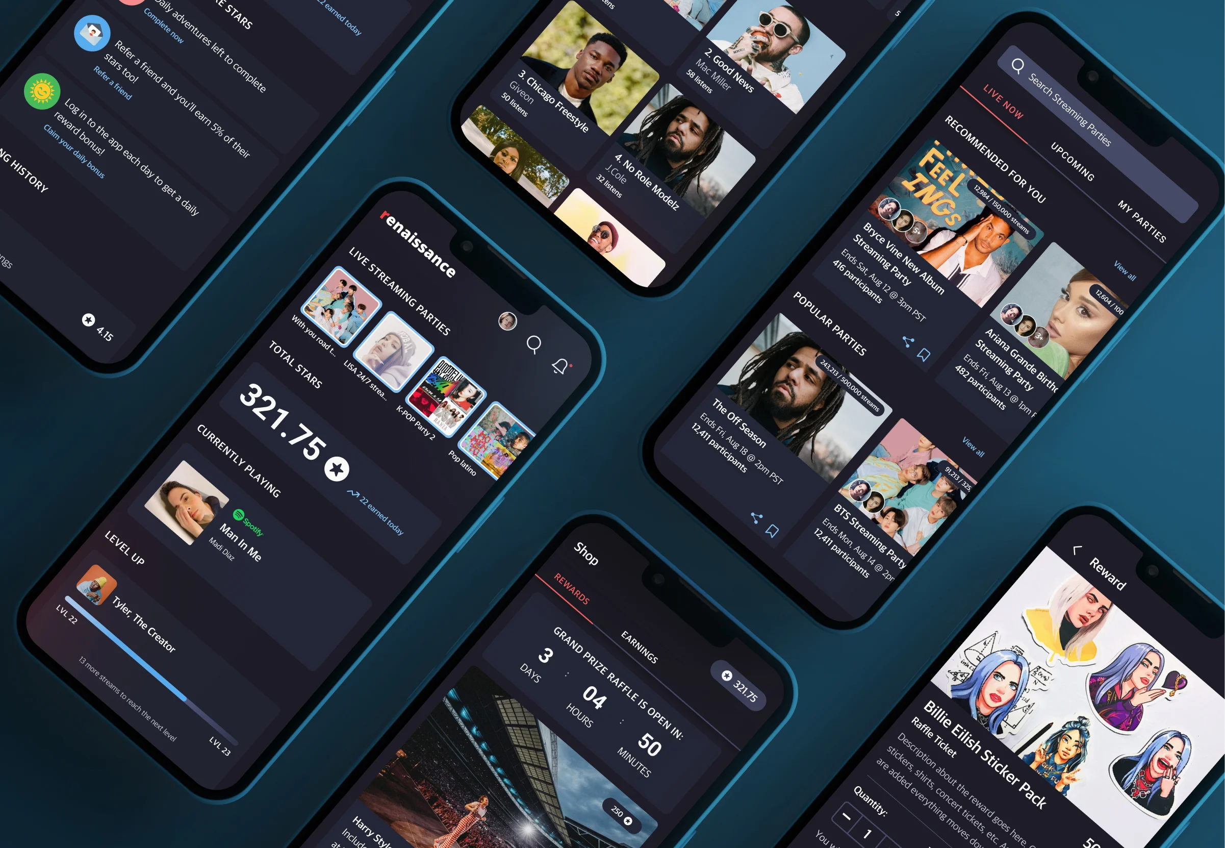
The original design
The original app included a leaderboard, streaming parties, basic stats, and a user profile.
Users could earn in-app currency (stars) by completing daily adventures and streaming music, which encouraged short-term engagement. However, because stars couldn’t be used in a meaningful way, motivation dropped over time and the experience felt unfinished.
I began with a heuristic evaluation, competitor research, and by compiling user reviews. Most apps that connect to Spotify focused on streaming stats and comparing music with friends, with very limited gamified ways for fans to connect directly with artists.
Mixed panel data, feedback on the app store, and social media discourse, showed this was what users actually cared about. Revealing a gap in the market.
The original app included a leaderboard, streaming parties, basic stats, and a user profile.
Users could earn in-app currency (stars) by completing daily adventures and streaming music, which encouraged short-term engagement. However, because stars couldn’t be used in a meaningful way, motivation dropped over time and the experience felt unfinished.
Concepting
Sketching and low-fidelity wireframes helped me explore concepts early and refine the direction with the team.
Sketching and low-fidelity wireframes helped me explore concepts early and refine the direction with the team.

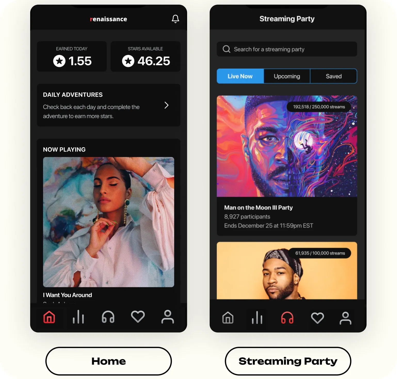
A key change made: I moved users profile to the top bar and added an earnings & rewards section to the bottom nav. Since earning rewards is key for users and the business, using a familiar UX pattern was essential.
A key change made: I moved users profile to the top bar and added an earnings & rewards section to the bottom nav. Since earning rewards is key for users and the business, using a familiar UX pattern was essential.
A key change made:
I moved users profile to the top bar and added an earnings & rewards section to the bottom nav. Since earning rewards is key for users and the business, using a familiar UX pattern was essential.
Sketching and low-fidelity wireframes helped me explore concepts early and refine the direction with the team.
Testing & Incorporating feedback
I conducted a mixed-method survey which received 70 responses.
The survey contained a series of questions related to the new features and a preference test comparing 2 versions of the same screen.
The responses from the usability study reassured us that despite a few small changes needed, users really liked the redesign.
I conducted a mixed-method survey which received 70 responses.
The survey contained a series of questions related to the new features and a preference test comparing 2 versions of the same screen.
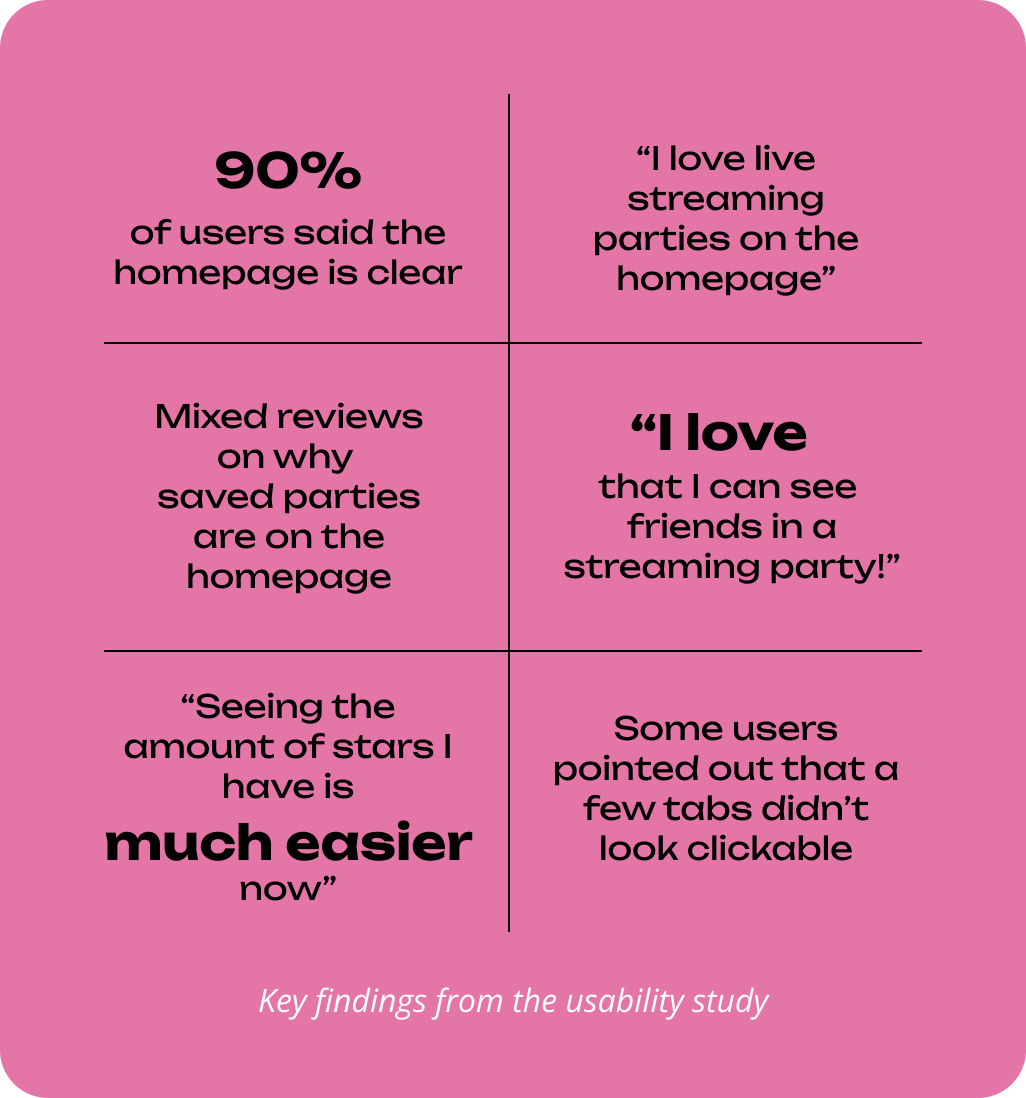
The responses from the usability study reassured us that despite a few small changes needed, users really liked the redesign.
UI overhaul
Next, I focused on the UI overhaul, focusing on standing out in a crowded music scene.
While choosing colours, typography, buttons, and other UI elements, I followed W3C accessibility standards and aligned with Spotify’s guidelines for components with their content included.
Finally, I created a style guide, design system and promotional graphics for social media.

Moodboard direction
Moodboard direction
Moodboard direction
Final Design
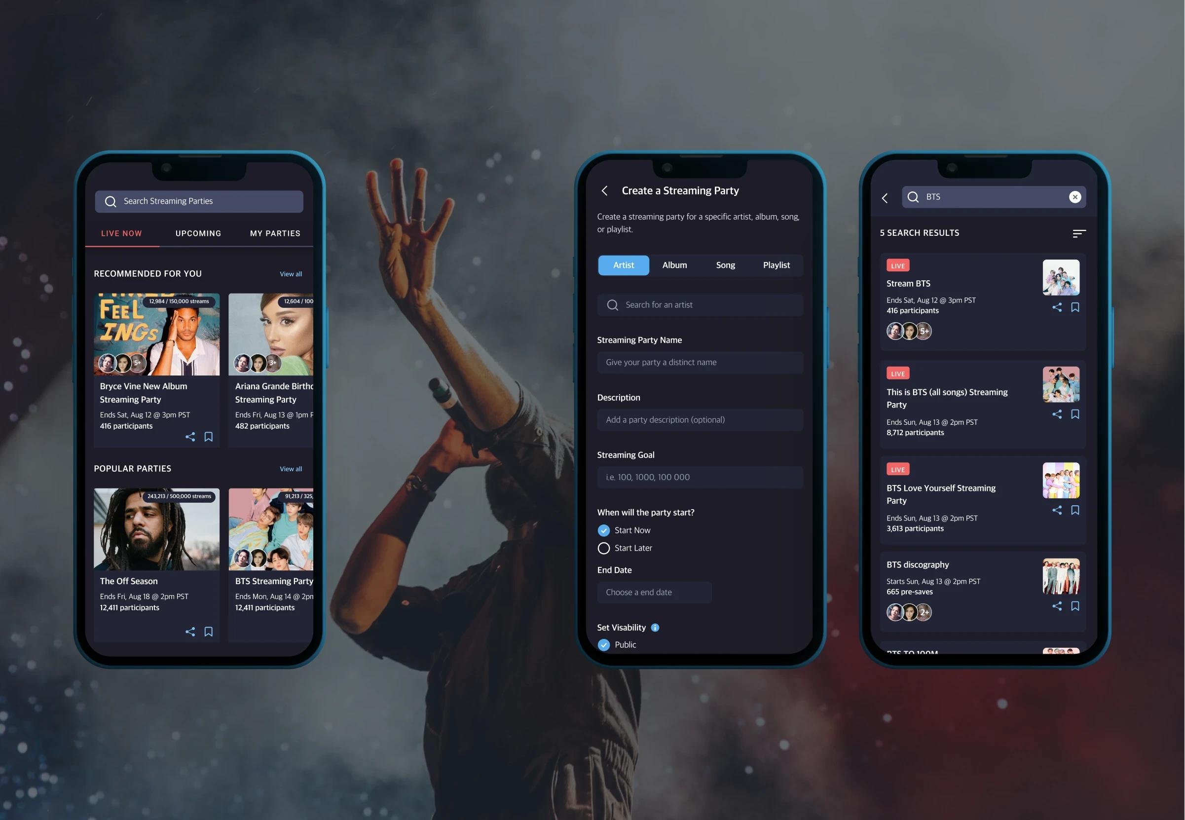
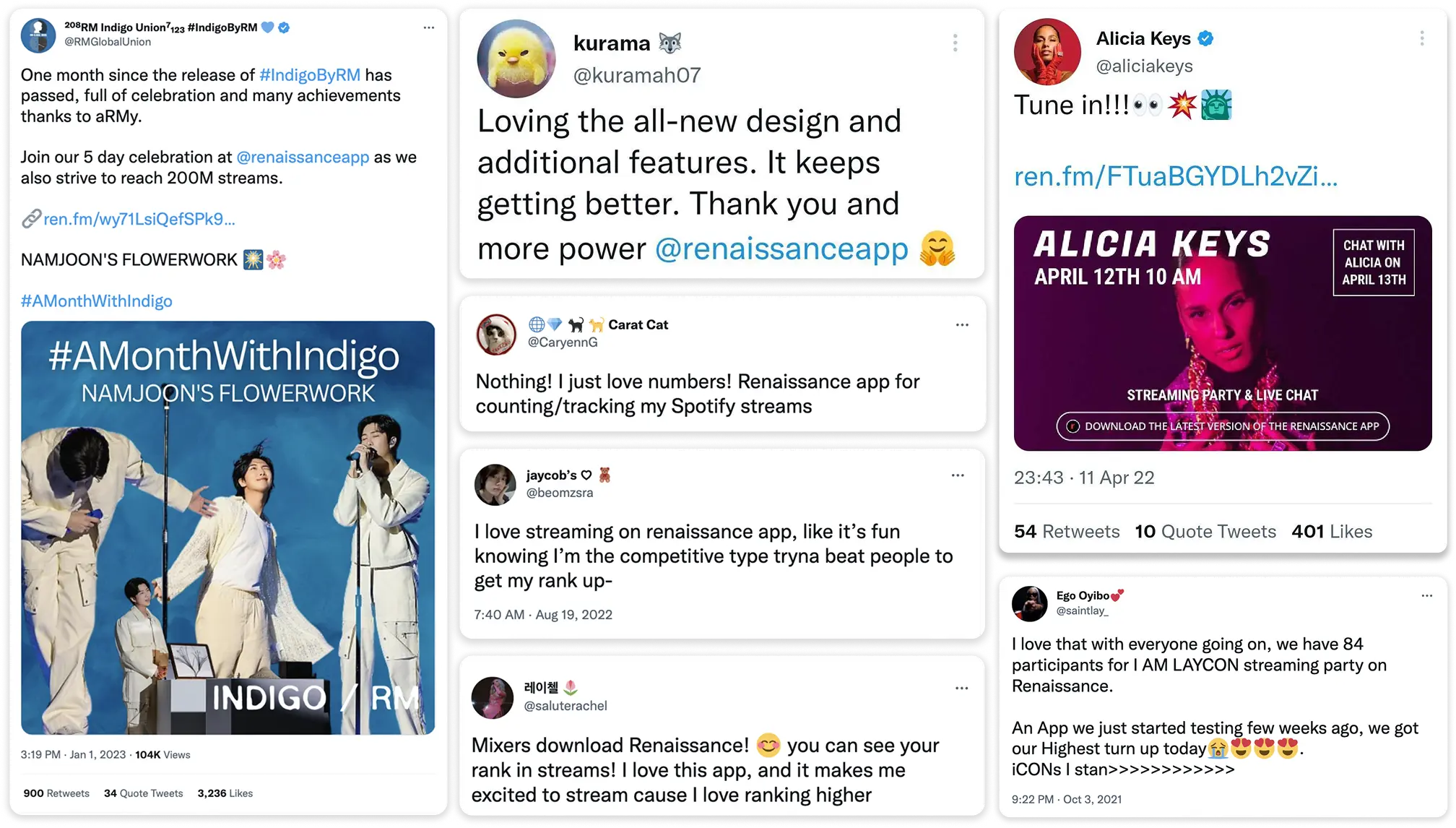
Streaming Party
Search for Streaming Parties, join recommended, popular or parties ending soon, favourite upcoming parties or create your own.
Search for Streaming Parties, join recommended, popular or parties ending soon, favourite upcoming parties or create your own.
Shop
Use your well earned stars on artist raffles & grand prizes! Not enough stars? Earn more by completing daily adventures, referring friends & streaming.
Use your well earned stars on artist raffles & grand prizes! Not enough stars? Earn more by completing daily adventures, referring friends & streaming.
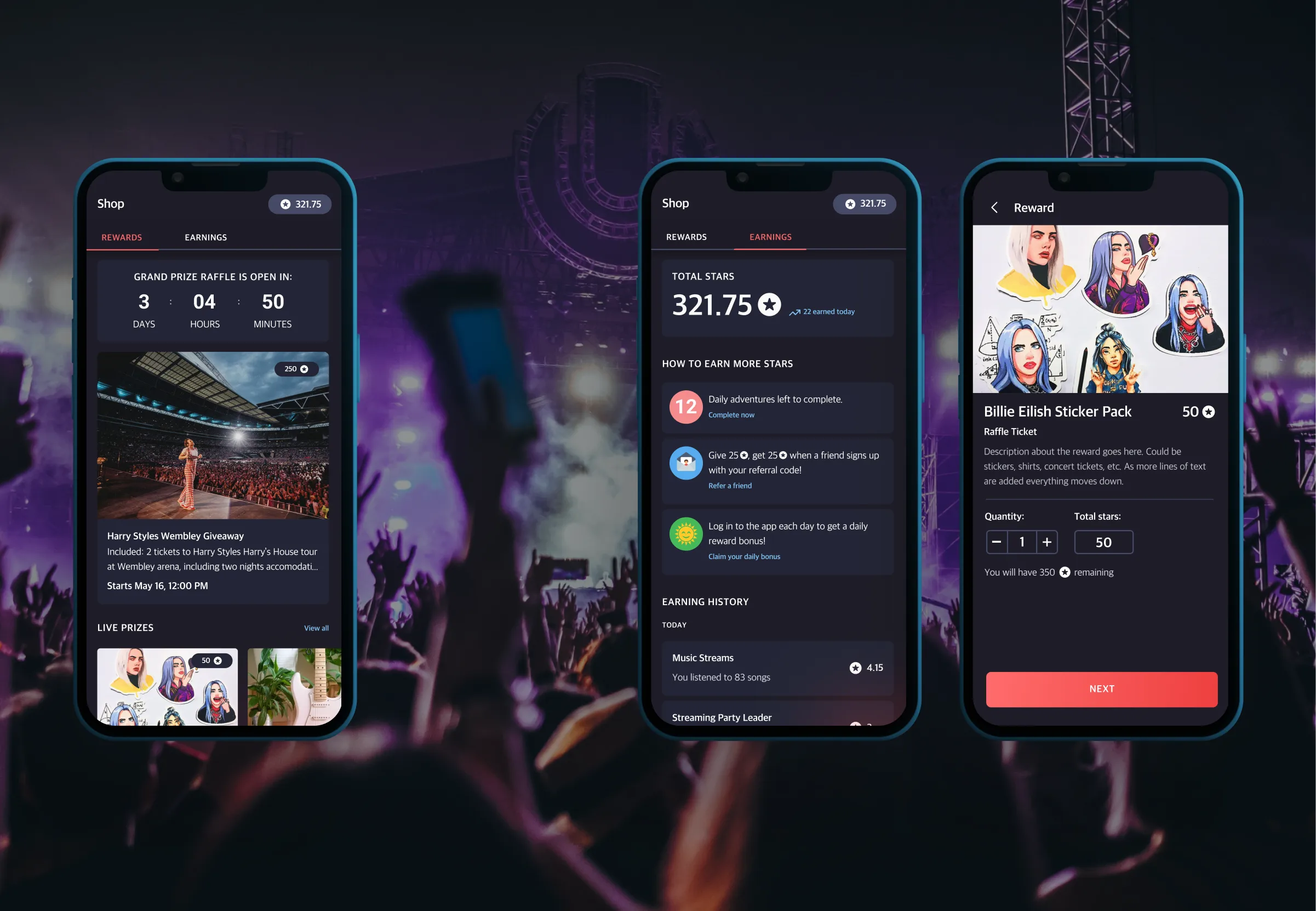
My Streams
What was once Favourites has now become My Streams! I created a flexible design allowing for more features and statistics
What was once Favourites has now become My Streams! I created a flexible design allowing for more features and statistics

Fun fact:
After redesigning the app, I was challenged to design the web app from scratch in 24 hours… challenge accepted ✅
After redesigning the app, I was challenged to design the web app from scratch in 24 hours… challenge accepted ✅

Summary
I absolutely loved redesigning the Renaissance app! It was great to work with such an amazing team on something that people care about so much.
I absolutely loved redesigning the Renaissance app! It was great to work with such an amazing team on something that people care about so much.
It was great to improve the app even further, and have since tested and designed multiple features such as; virtual festivals, premium profile & a social media feed.
It was great to improve the app even further, and have since tested and designed multiple features such as; virtual festivals, premium profile & a social media feed.
It was great to improve the app even further, and have since tested and designed multiple features such as; virtual festivals, premium profile & a social media feed.